BITE - SIZED TOOLS FOR STUDENT WELL-BEING
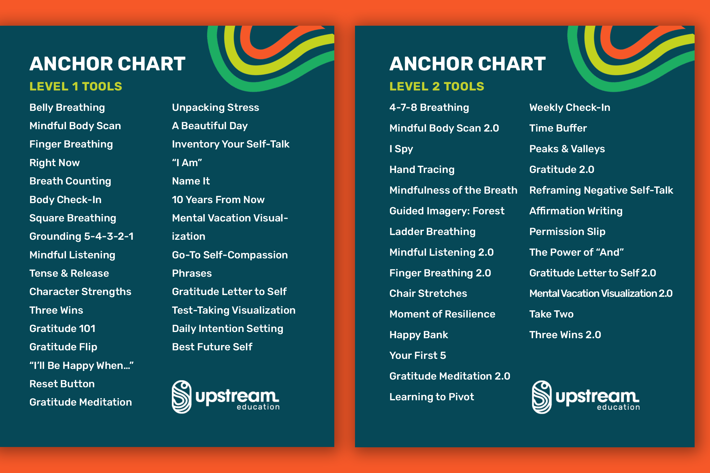
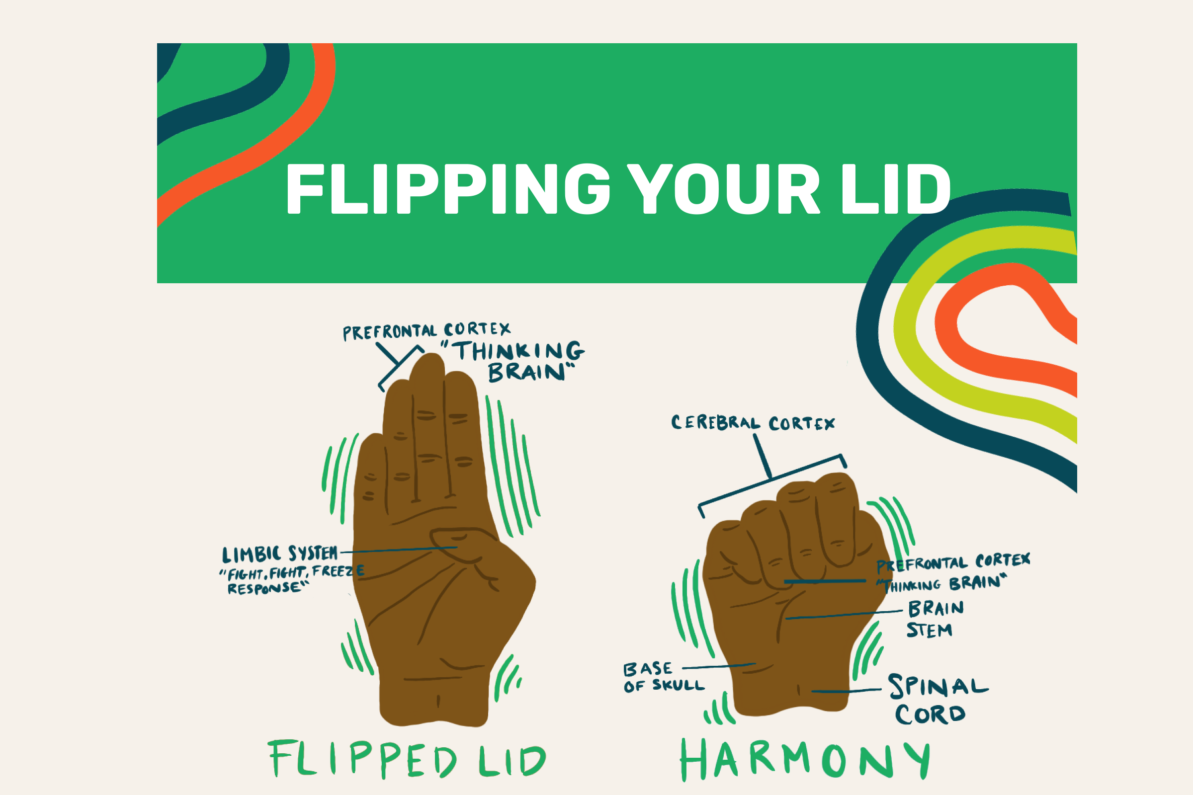
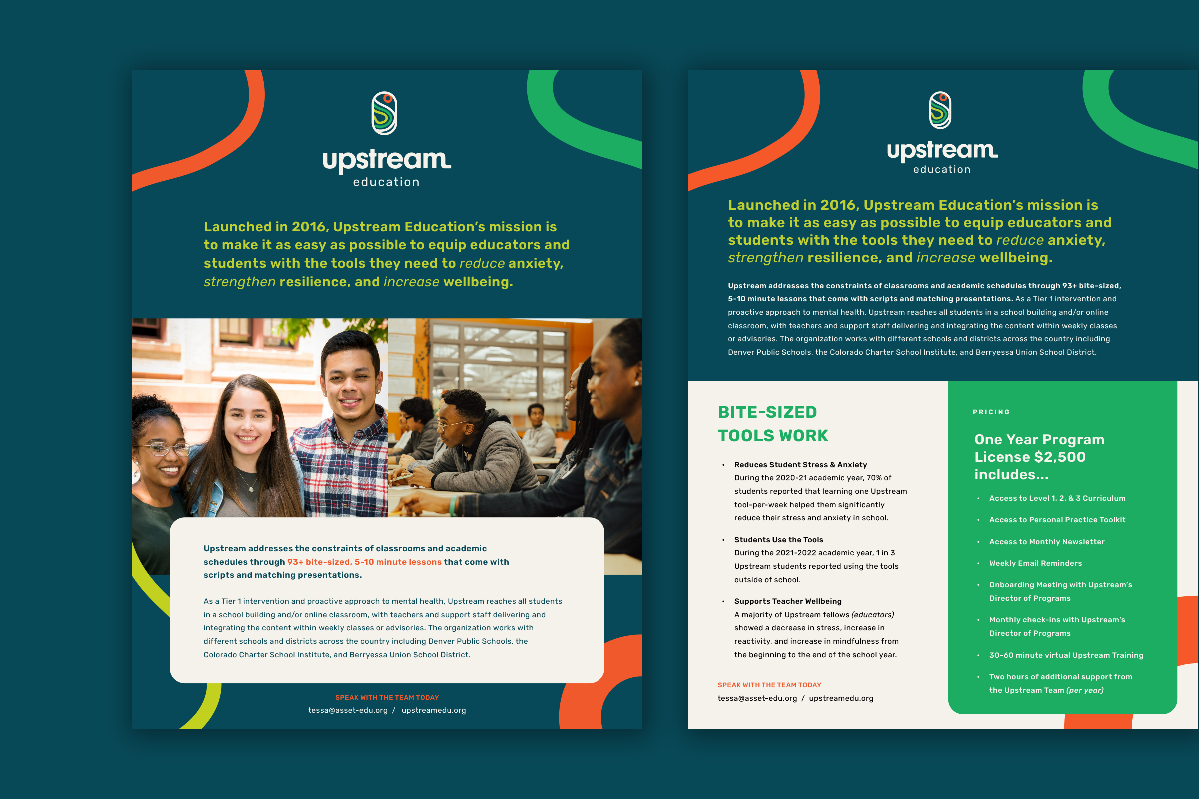
Upstream Education came to us with a need for a new name, new visual identity, and website design to be able to resonate with teachers, counselors, administrators and students. We wanted it to feel accessible, dignifying, and caring while being known as partners to their schools. These tools are by teachers for teachers so we wanted to really highlight the easy to use, bite-sized and scalable aspect of Upstream.
Upstream is the only SEL program partner that offers intuitive, time-sensitive tools & strategies for schools proactive about mental health who want educators and students to take better care of themselves and each other in time- and resource-constrained middle and high school classrooms during a youth mental health crisis.
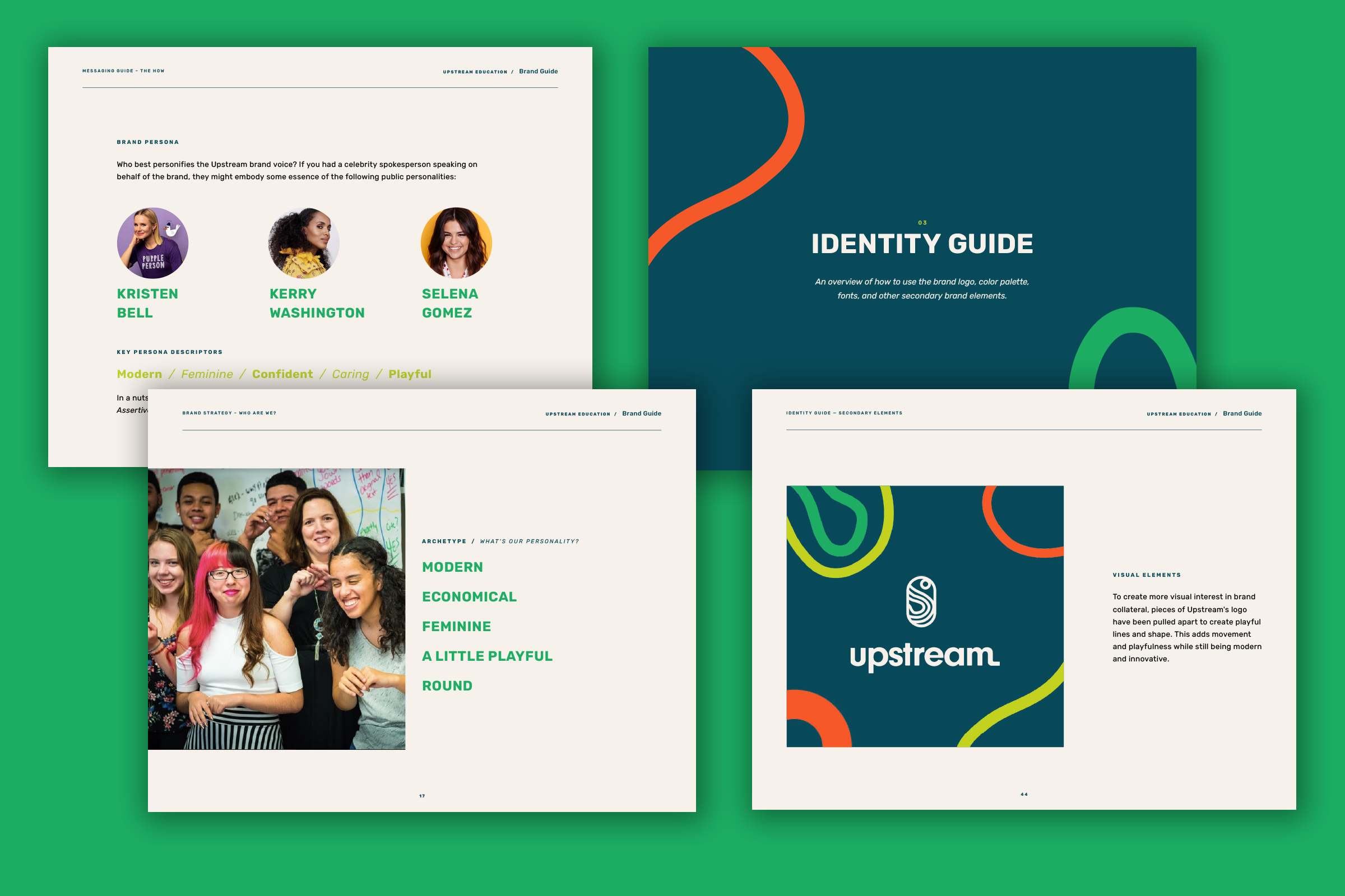
Diving into the brand strategy + naming with Upstream we did 3 workshops with the client to get clarity on where they are and where they want to be in order to create a roadmap/brand guide that will carry them through this next phase of their business with confidence. During these workshops is when the name organically popped up and with a good amount of research and creative ideation we decided the name Upstream highlights their proactive approach to mental health and wellbeing.
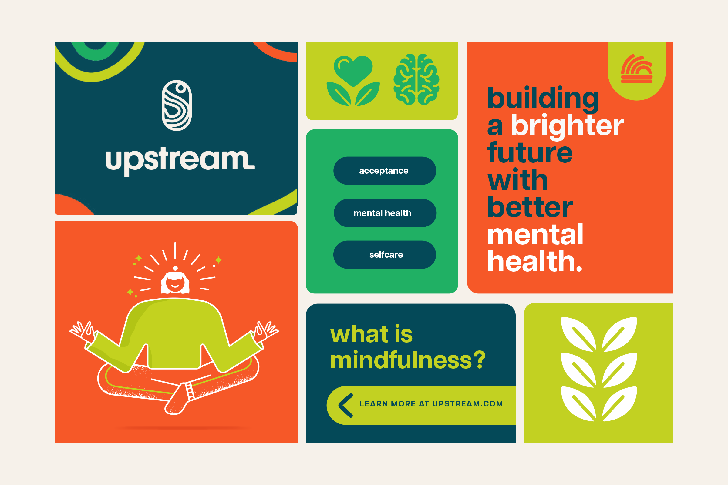
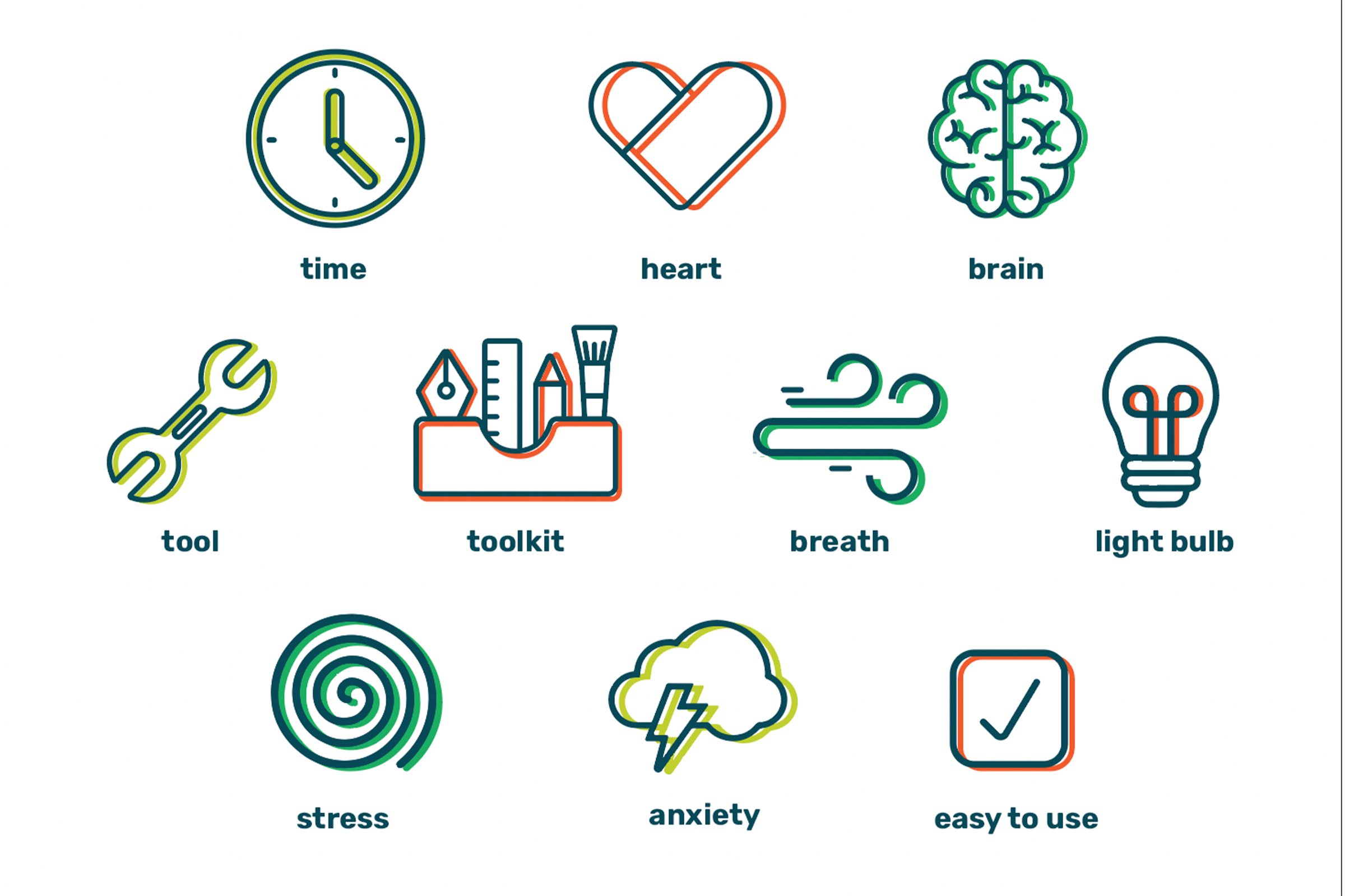
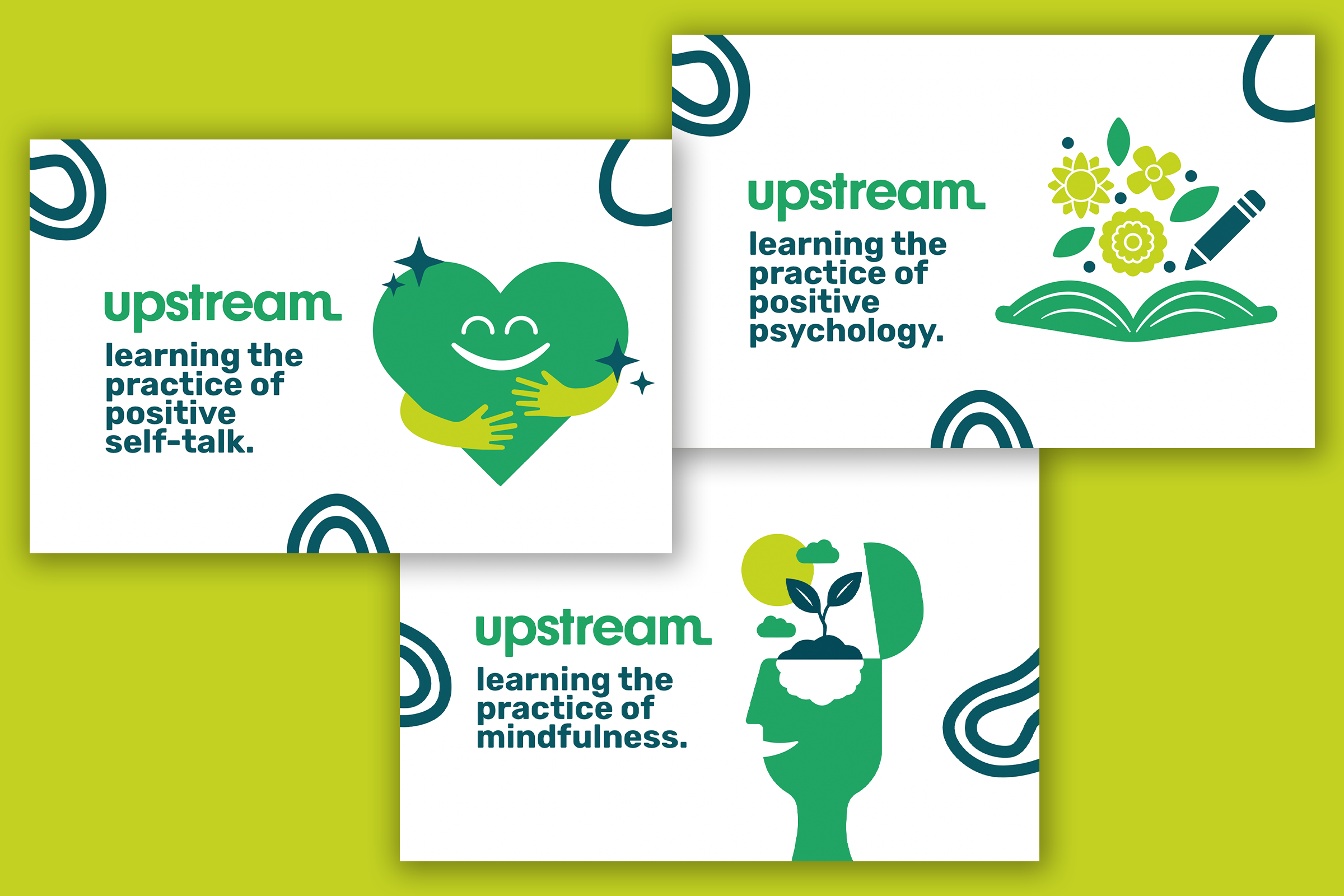
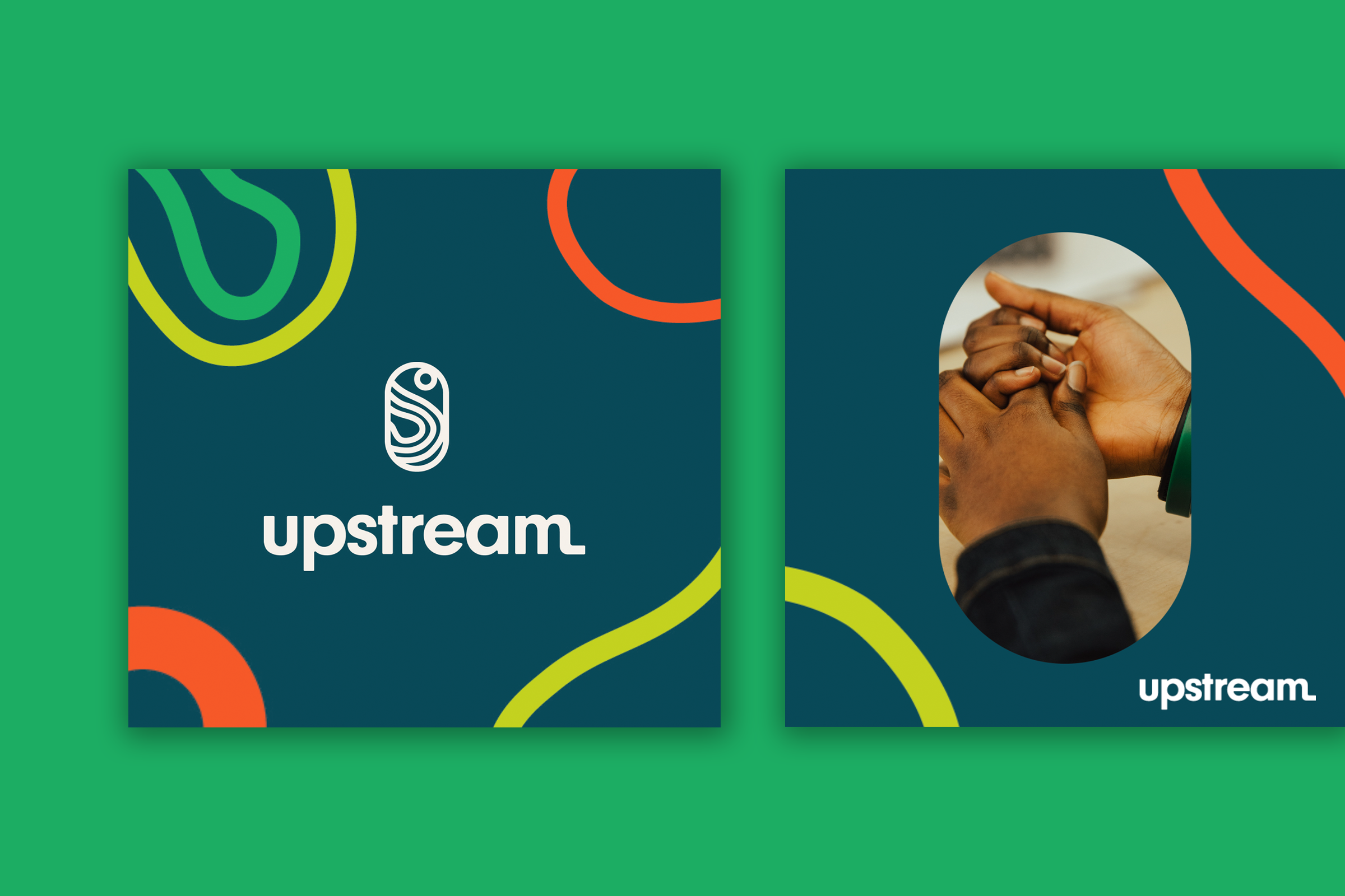
The visual identity was build from the ground up starting with having the finalized brand strategy, knowing our positioning, mission, vision, values, and customer we dove into the creative direction follow by stylescapes and into logo concepting. From here the brand really started to come alive as we sprinkled in elements, icons, illustrations and messaging.
Client: Upstream Education
Location: Colorado
Industry: Education
Website: www.upstreamedu.org
Our Role:
+ Creative Direction
+ Visual Identity
+ Web Design
+ Naming
+ Brand Strategy
+ Campaigns

